4 Design Updates That Make Your Client Scheduling Page Easier to Use
Smoother bookings, stronger first impressions
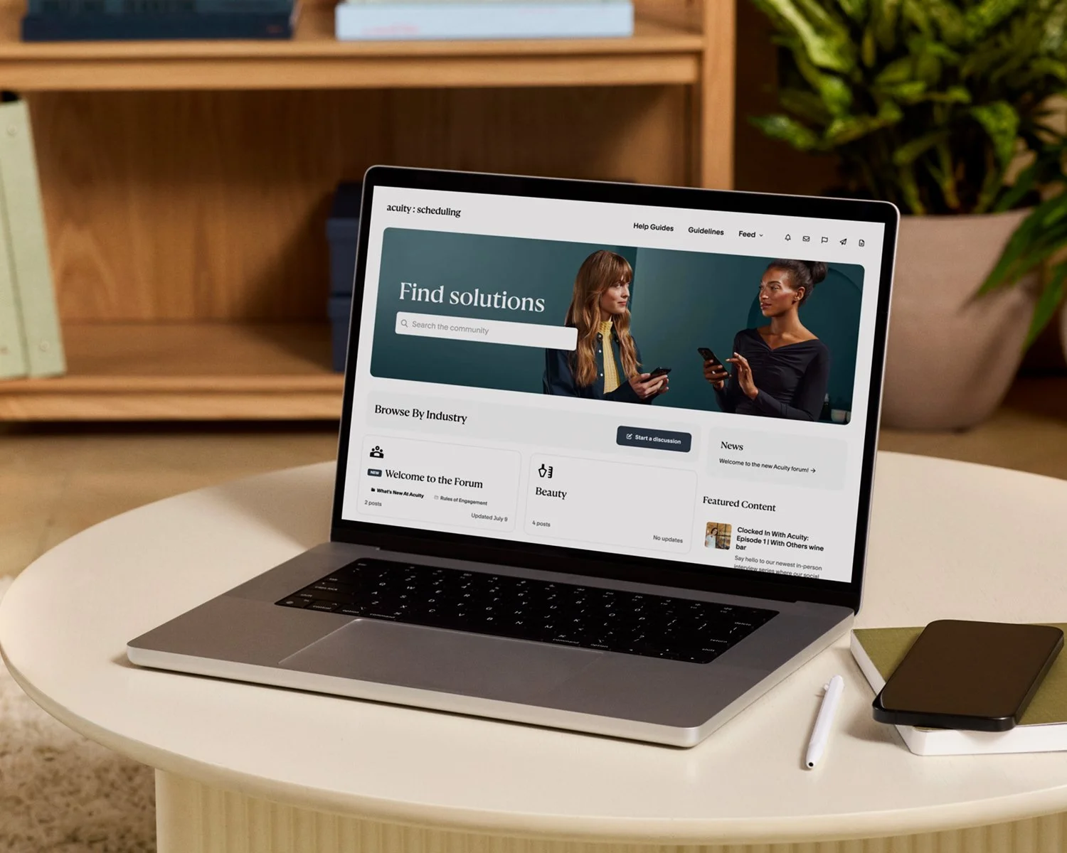
Your booking page often serves as a client’s first interaction with your business. It should feel clear, polished, and aligned with your brand from the first click.
Little things—like how text reads or where details appear—add up to a big impression. A smoother flow, fewer distractions, and more control over how you display your services can make clients more likely to book (and rebook). That’s exactly what Acuity Scheduling’s latest updates deliver.
We’ve rolled out 4 new design enhancements to the Client Scheduling Page that make your booking flow cleaner, easier to read, and more focused on what matters most: clients booking time with you.
What’s new on the Acuity Client Scheduling Page
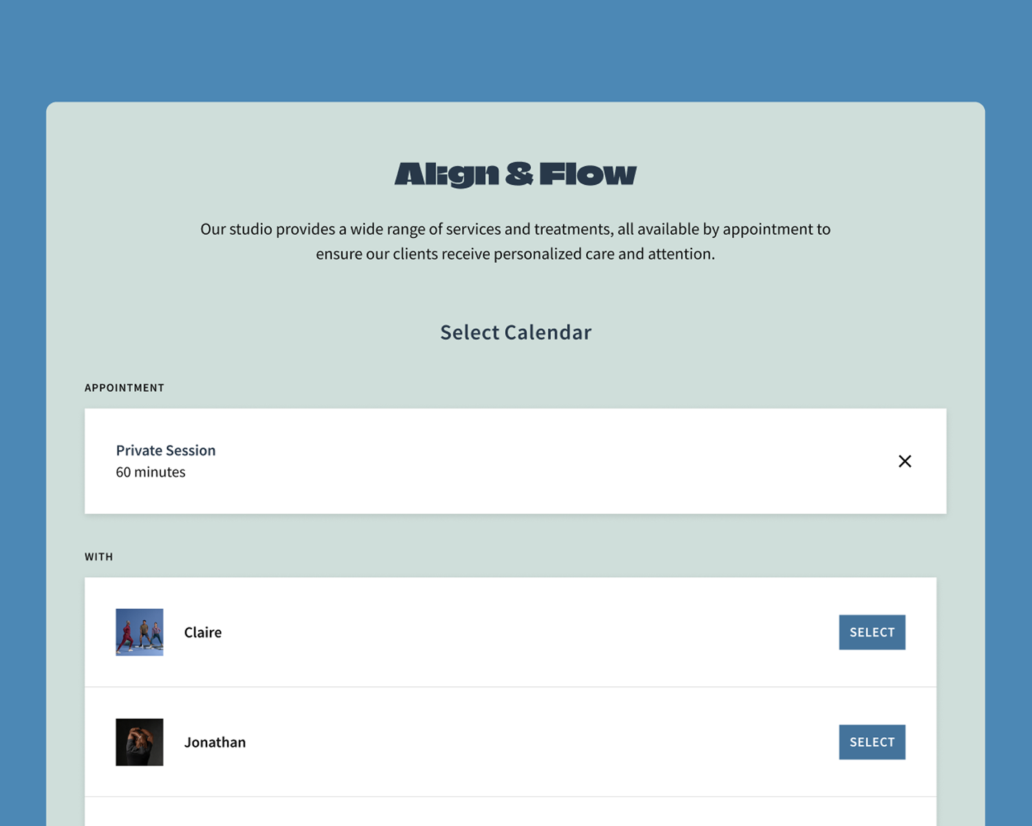
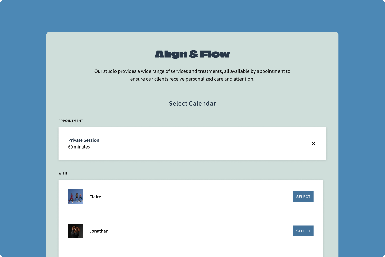
1. Show or hide your calendar name for a cleaner look
Previously, Acuity automatically pulled in both your appointment details and calendar name into the booking flow. On the Client Scheduling Page, this meant that your appointment types displayed as “Appointment name with calendar name.” Now you get to decide whether to show or hide the calendar name in your flow.
For larger businesses with multiple staff or locations, showing the calendar name in the booking flow reminds clients who they’re seeing for an appointment. For anyone who already includes their location or staff member’s name in the appointment title, hiding the calendar name avoids redundancy and keeps the page simple.
To show or hide your calendar name in Acuity, click Scheduling Page, then click Settings. The features you can turn on and off are listed below the Account Language dropdown menu.
Did you know? Instead of creating staff-specific appointments where you add the staff member’s name in the appointment title, you can use appointment type settings to assign appointments to the right practitioner(s), keeping your schedule organized behind the scenes while presenting a polished view to clients.


2. Easier-to-read forms with sentence case
Reading all-caps text can be slower and harder to scan, especially for clients with dyslexia or other cognitive impairments. To improve readability, Acuity is removing the automatic all-caps formatting on intake forms. Now, whatever casing you use—sentence case, title case, or even all lowercase letters—will display exactly as you enter it.
For clients, this makes forms more legible and approachable. For you, it means more control over how your brand comes across in every step of the booking process.
Did you know? Forms are available on every plan level, so you can collect everything from consent agreements to intake questions in a way that fits seamlessly into your booking flow.
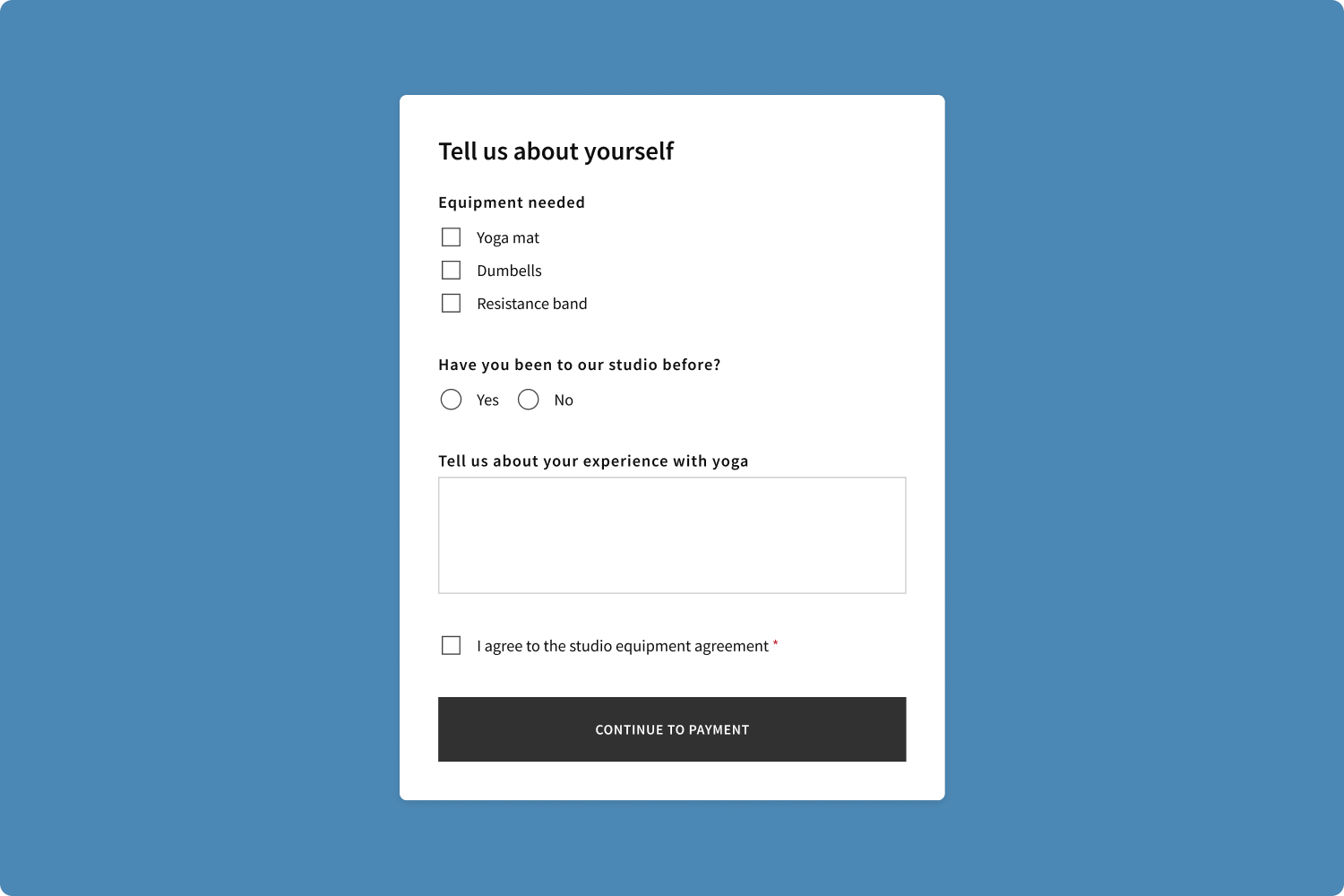
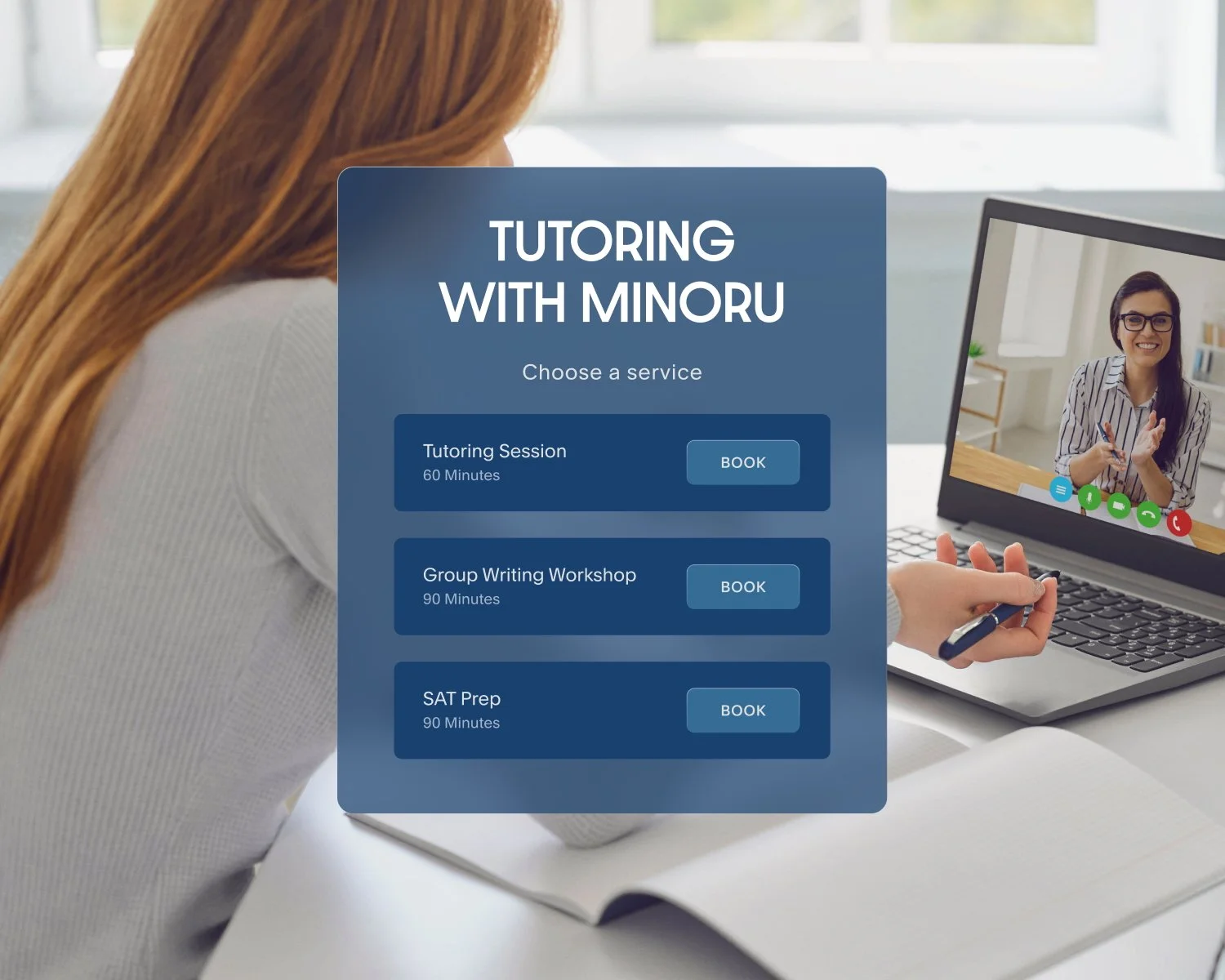
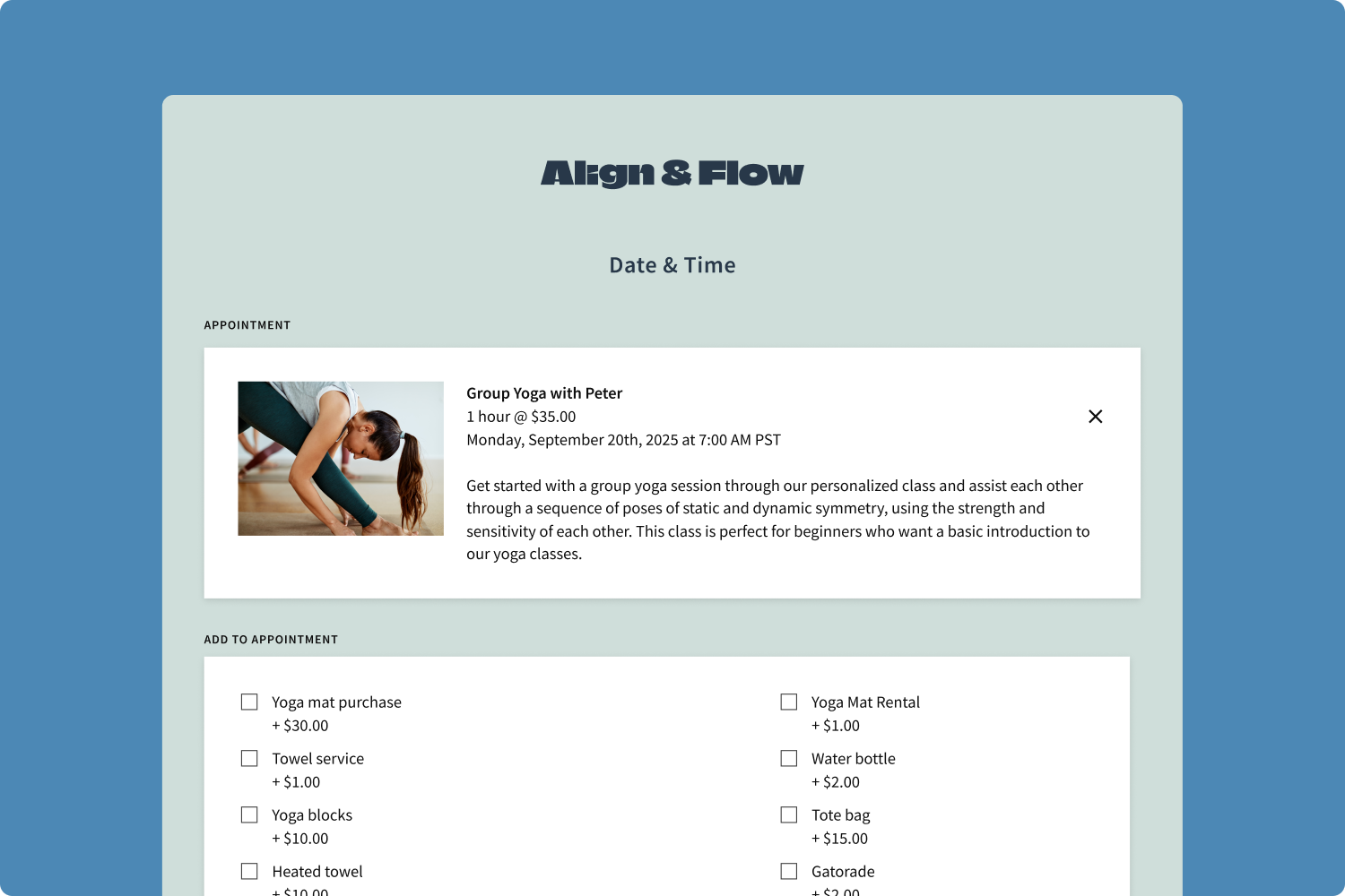
3. Full appointment and add-on details without truncation
If your appointment descriptions run long or you offer more than 6 add-ons, Acuity previously condensed that information with a “show all” option. Now you have the flexibility to disable truncation so descriptions and add-ons display in full.
Appointment descriptions: Ensure clients see all the important details at a glance, like what each service includes or what they should bring with them.
Add-ons: Highlight supplemental services right away to improve discoverability and maximize your opportunities to upsell.
This update gives you the choice to present information in the way that best supports your business and makes booking decisions easier for clients.
Did you know? You can add images to your appointment types to highlight your services even further, helping clients select the perfect option at a glance.
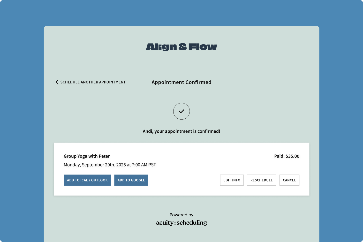
4. A streamlined confirmation page for next steps
Confirmation pages should confirm and guide. With this update, your scheduling instructions stay at the start of the booking flow, where they're most helpful.
The confirmation step can now shine a spotlight on what matters most: celebrating the booking and making next steps clear. The result is a cleaner, more intentional finish that reinforces the client's choice and helps them feel more confident moving forward.
Did you know? Scheduling instructions appear at the top of your scheduler. You can customize them with text, images, general information about your business, an embedded map to your location(s), and more to guide clients before they click “Book.” This is an account-wide setting, so these instructions will appear even on direct links for all appointment types and calendars.
Small updates, big impact on client scheduling
Each of these changes is simple on its own, but together they make your booking page feel smoother, sharper, and more aligned with your brand. They also give you more control over how clients experience your business, from the first click to the final confirmation.
Think of your Client Scheduling Page as both a tool and a part of your brand story. With these updates, it works harder to showcase your services, guide clients with ease, and make booking feel effortless.
Log in to your Acuity account today to explore the new settings, or start a free trial to see how polished and professional your online booking experience can be.